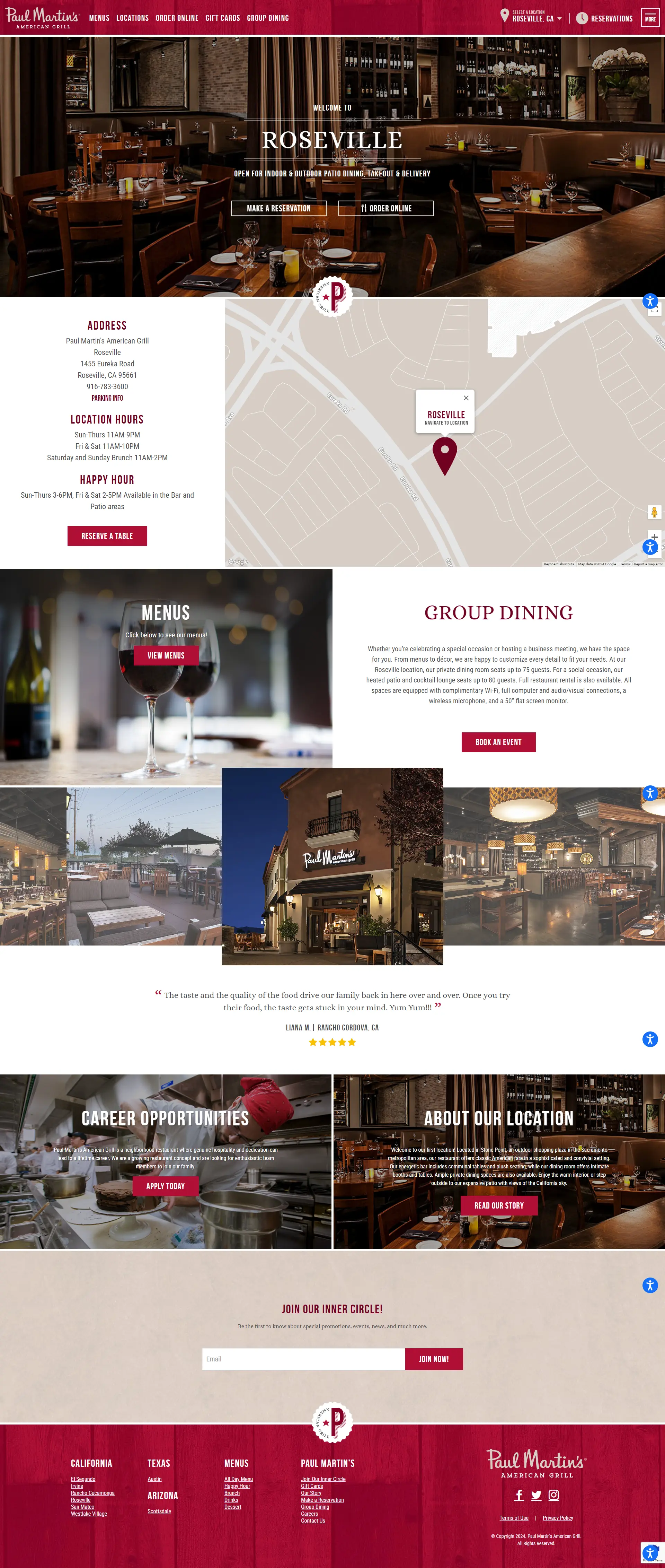
A call to action (CTA) is a button or link that prompts visitors to take a specific action, such as signing up, downloading, or purchasing.
A call to action (CTA) is a crucial element of any landing page design. It’s the specific action you want visitors to take after landing on your page. A well-crafted CTA can significantly influence your conversion rate.
Key characteristics of effective CTAs include:
- Clear and concise: The CTA should clearly state the desired action and be easy to understand.
- Visually appealing: The CTA should stand out from the rest of the page and be visually appealing to encourage clicks.
- Strong verb: Use a powerful verb to create a sense of urgency or excitement, such as “Sign Up Now,” “Buy Now,” or “Download Now.”
- Benefit-oriented: Highlight the benefit the visitor will receive by taking the action.
- Strategic placement: Place the CTA prominently on the page, above the fold if possible, to ensure it’s easily visible.
Examples of effective CTAs:
- “Start Your Free Trial”
- “Download Our Ebook Now”
- “Sign Up for Our Newsletter”
- “Shop Now”
- “Contact Us”
By creating compelling CTAs, you can increase the likelihood of visitors taking the desired action and achieving your landing page goals.


